primary logo
secondary logo
2024
I began working with Driveway Auto Spa when it was still a small, growing business. I helped create their logo and build a cohesive brand identity from the ground up, establishing a clean, professional visual foundation that carried across social media and marketing materials.
challengesA key challenge was building brand recognition in a competitive market with limited visibility. I focused on creating a strong, consistent visual identity that would stand out while remaining scalable. As the business grew, maintaining brand consistency across new content and promotions required clear guidelines and adaptable design assets to support long-term growth.
Graphic Designer
Photoshop, Illustrator, Affinity
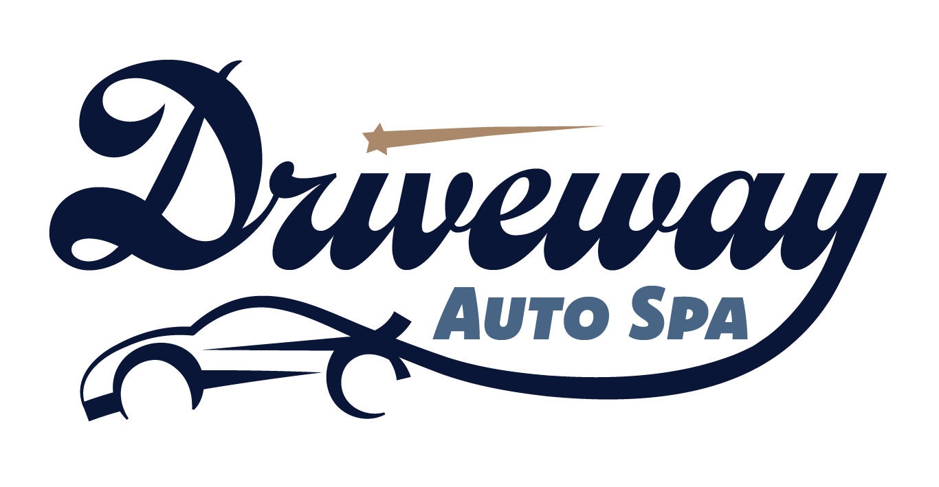
This logo blends luxury and modern design through its elegant script typography paired with sleek automotive detailing. The flowing custom 'D' and refined navy color palette create a sense of sophistication, trust, and premium quality. Combined with the minimal, streamlined car silhouette, the design feels polished, contemporary, and confidently high-end.


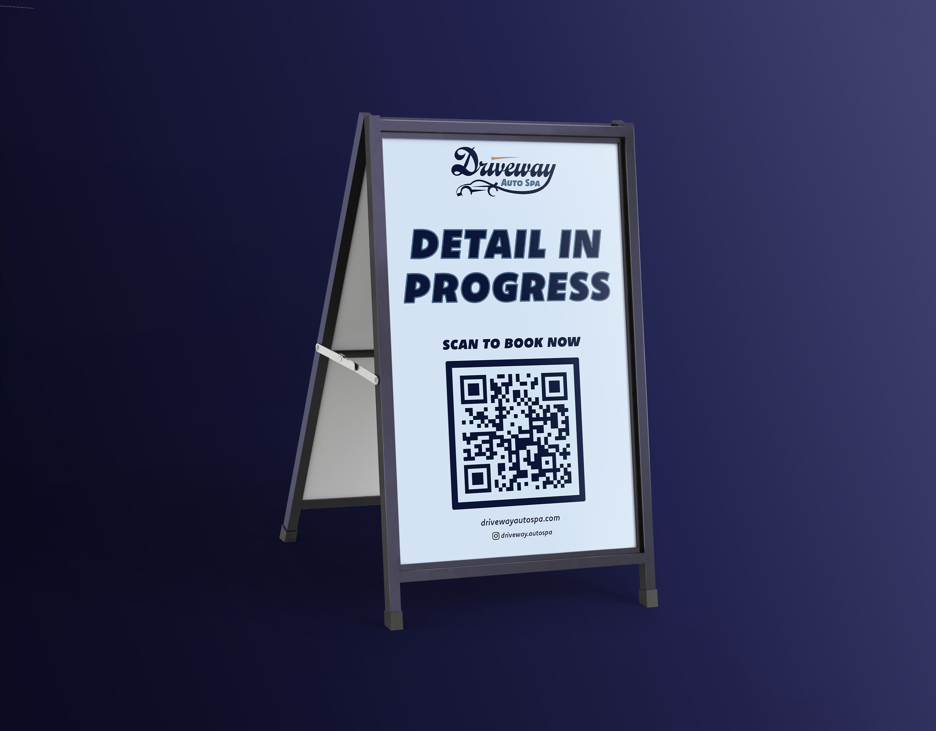
I designed a branded A-frame sign for Driveway Auto Spa to place outside clients' homes during detailing appointments, turning each service into a live marketing opportunity. The layout was bold, clean, and easy to read from a distance, ensuring strong visibility in residential neighborhoods. This strategic touchpoint helped increase local awareness, spark curiosity, and attract new clients through real-time exposure.
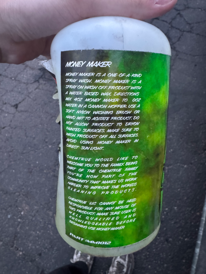
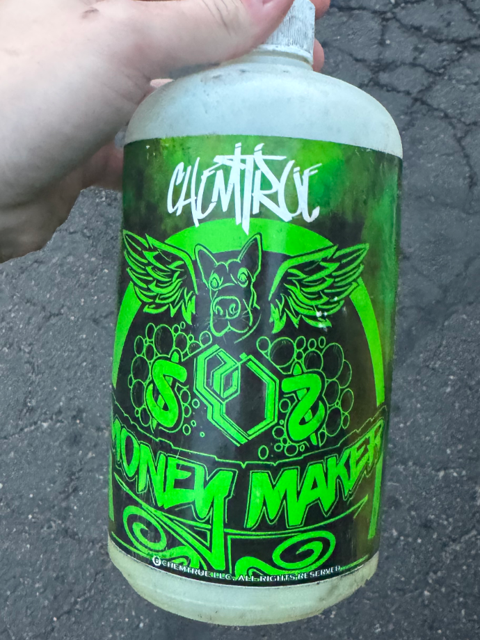
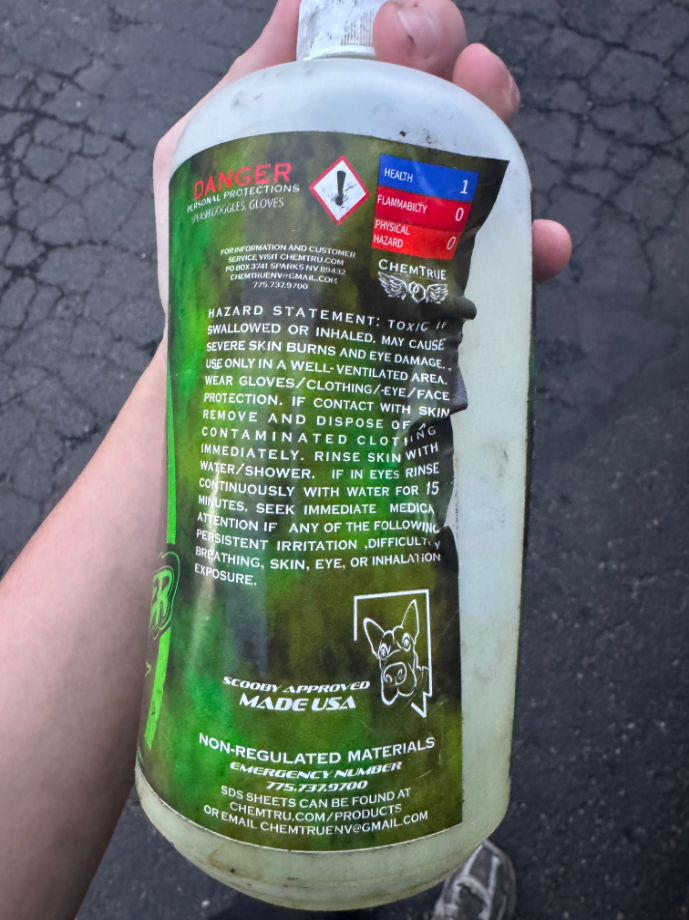
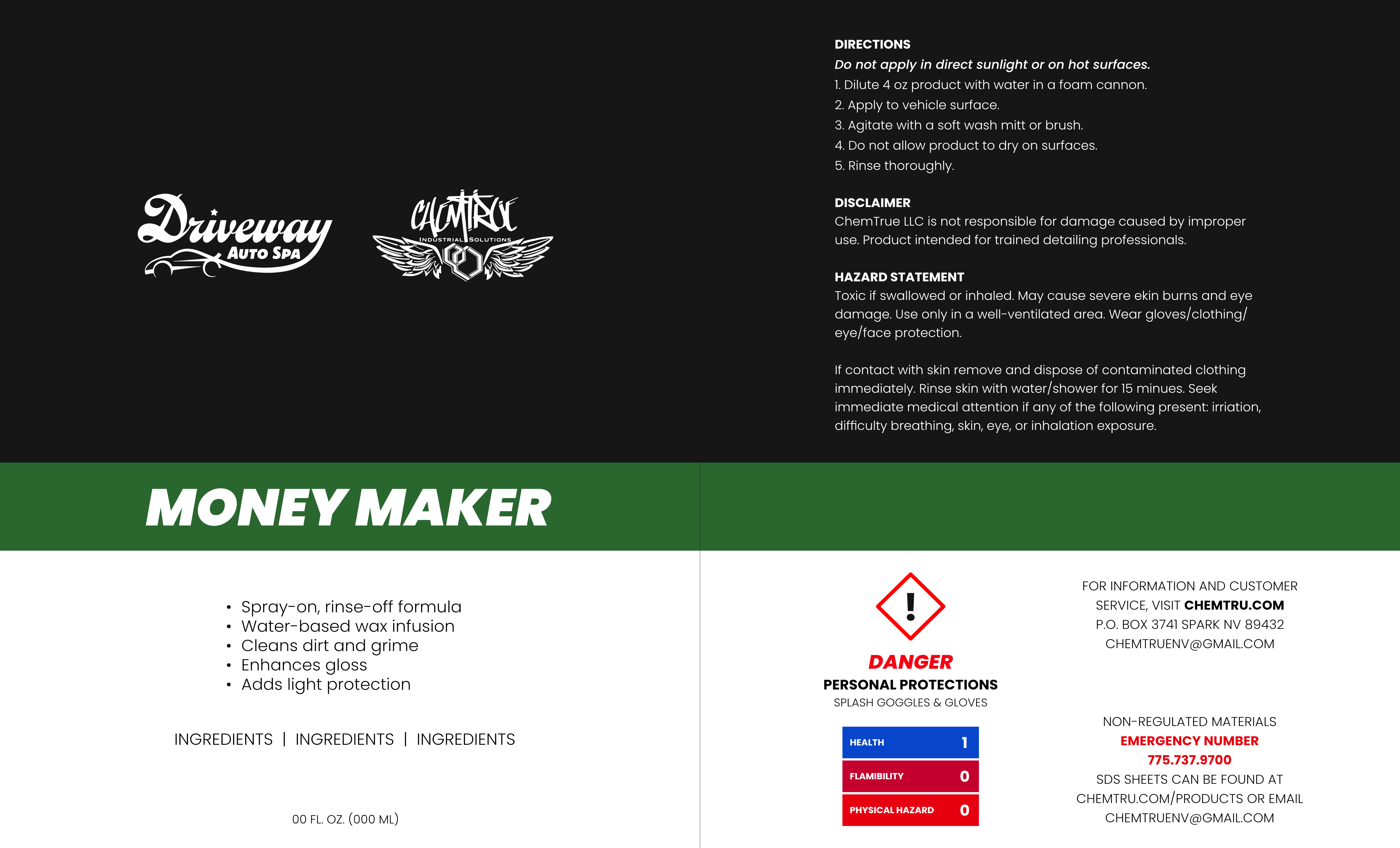
Driveway Auto Spa partnered with Chem True to launch their own branded product line, creating an opportunity to expand beyond services and into retail. I redesigned the Chem True bottle to reflect Driveway's elevated brand identity, ensuring the packaging felt cohesive, bold, and professional.
During the initial review of the bottle design, I identified cluttered layout and excessive wordiness on both sides of the label. Additionally, the background did not effectively communicate the sense of 'clean' associated with the product. In the redesign, I first focused on refining the copy, applying typography principles to make the messaging clearer and more concise. I then reimagined the background, maintaining the original visual concept while enhancing readability and overall visual clarity.
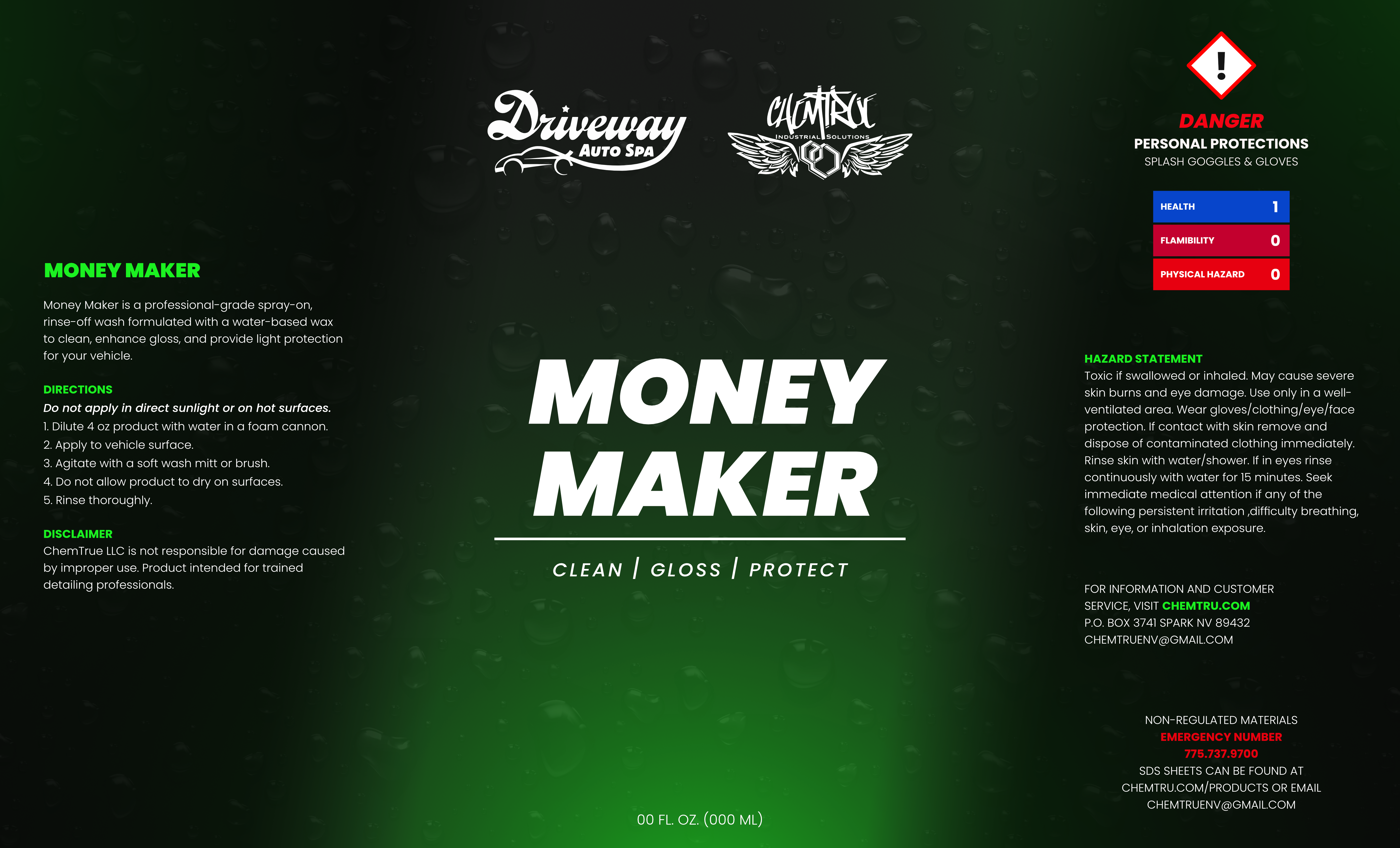
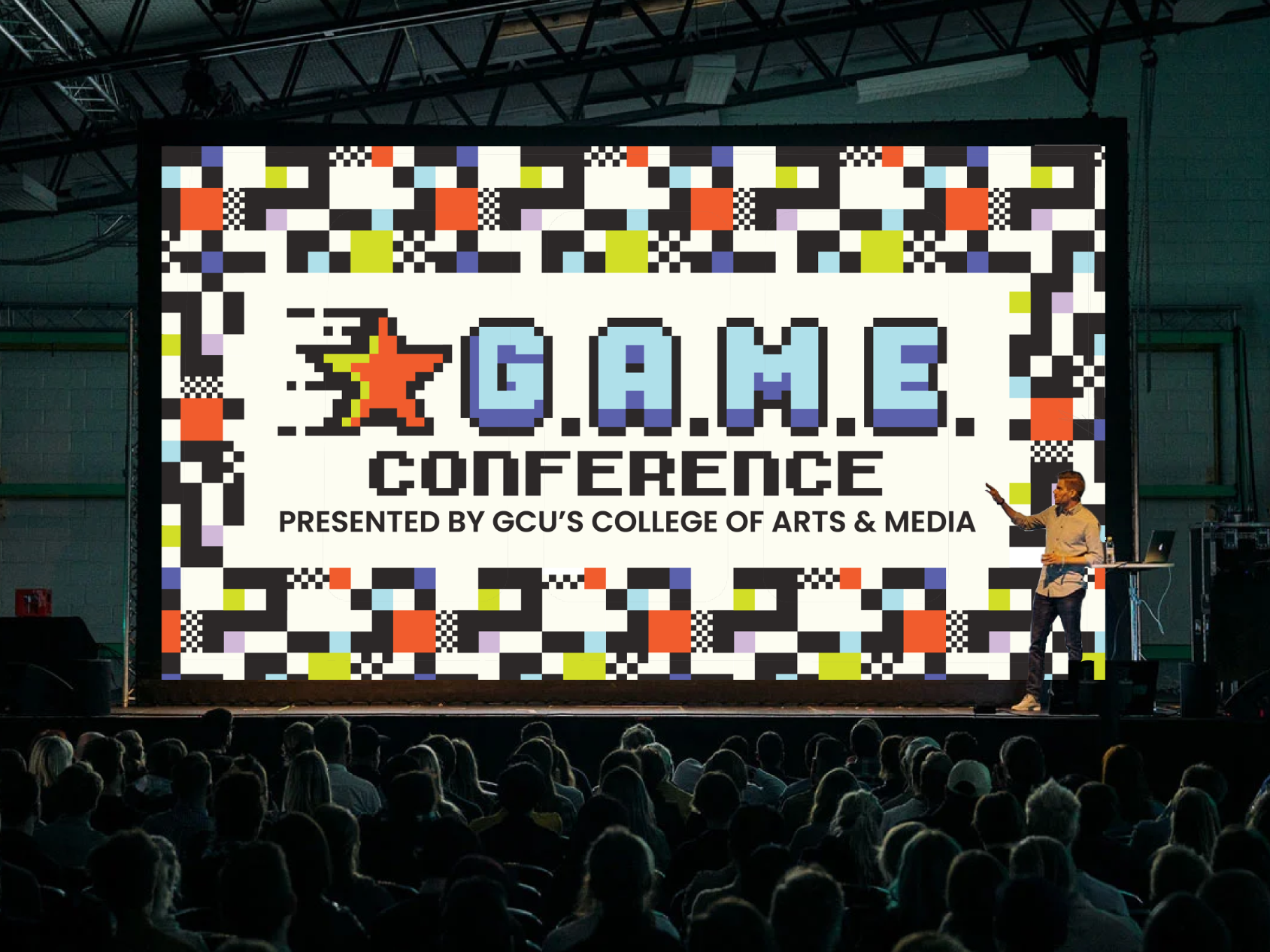
After designing the first two concepts, I was given additional direction for the final design. I moved away from the green color palette and shifted toward blue tones to better fit the updated vision. The final version focuses on a simpler, cleaner layout while still maintaining the overall gaming theme.